
promotion bundle landing page
KiwiHR, an HRIS startup based in France, Recruitee planned to integrate both software (Recruitee and KiwiHR) to become the leading all-round HR software in the EU market.
web design ✴︎ visual designer
project overview
challenge
To test demand, Recruitee needs a landing page as the single source of truth for the bundle package offer meetings led by the sales department.
constraints
time
design flexibility
decisions
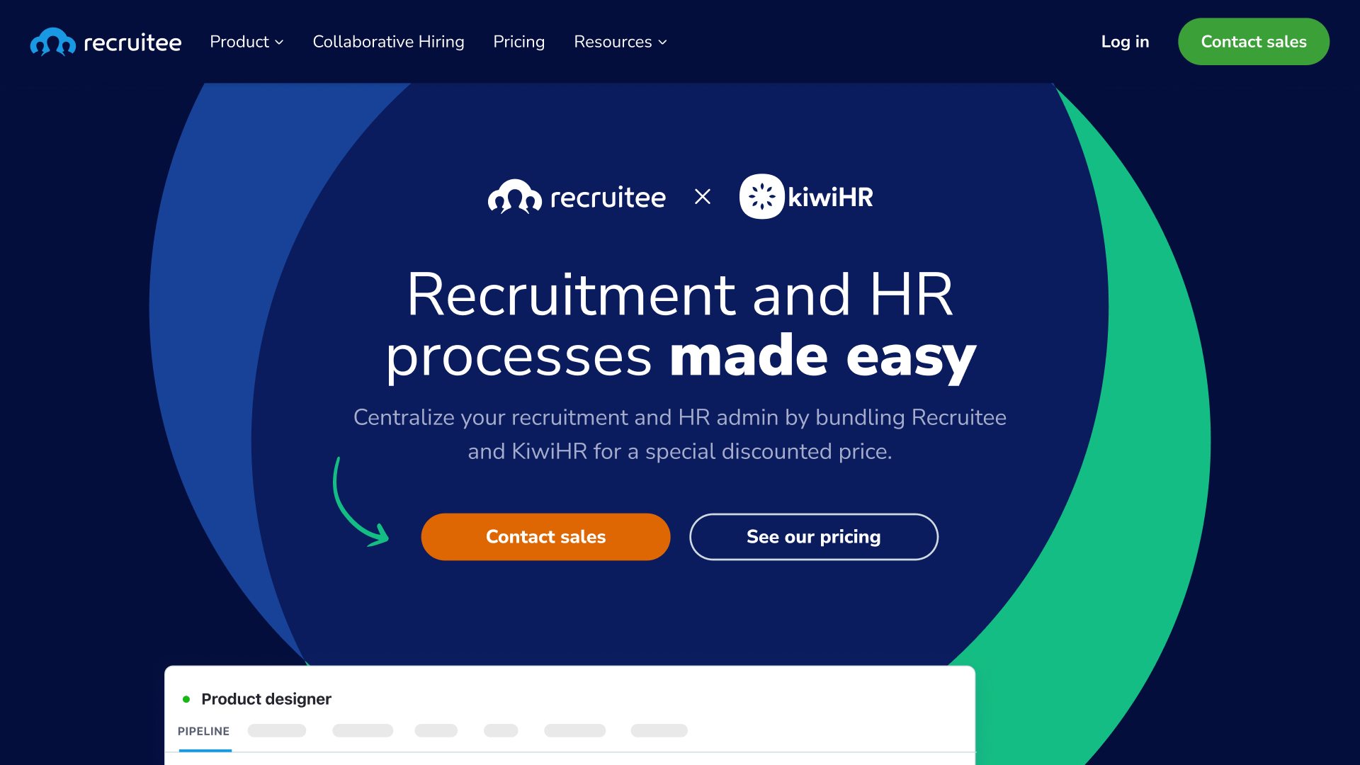
Key visual → The Venn diagram represents the joining of 2 companies, the colours use 2 of KiwiHR’s and one of Recruitee’s primary colours.
Branding → combined both brands’ guidelines and made compromises, some examples:
Stock photos → custom visuals to explain the VP
Recruitee’s icon library instead of KiwiHR’s
KiwiHR's primary colour is the primary colour
Handwritten style → adds personal, close, and warm feelings. Ovals and lines mimic a scanned document for the new bundle deal, while arrows highlight non-copy elements, such as directing to the pricing table and matching visuals with copy.
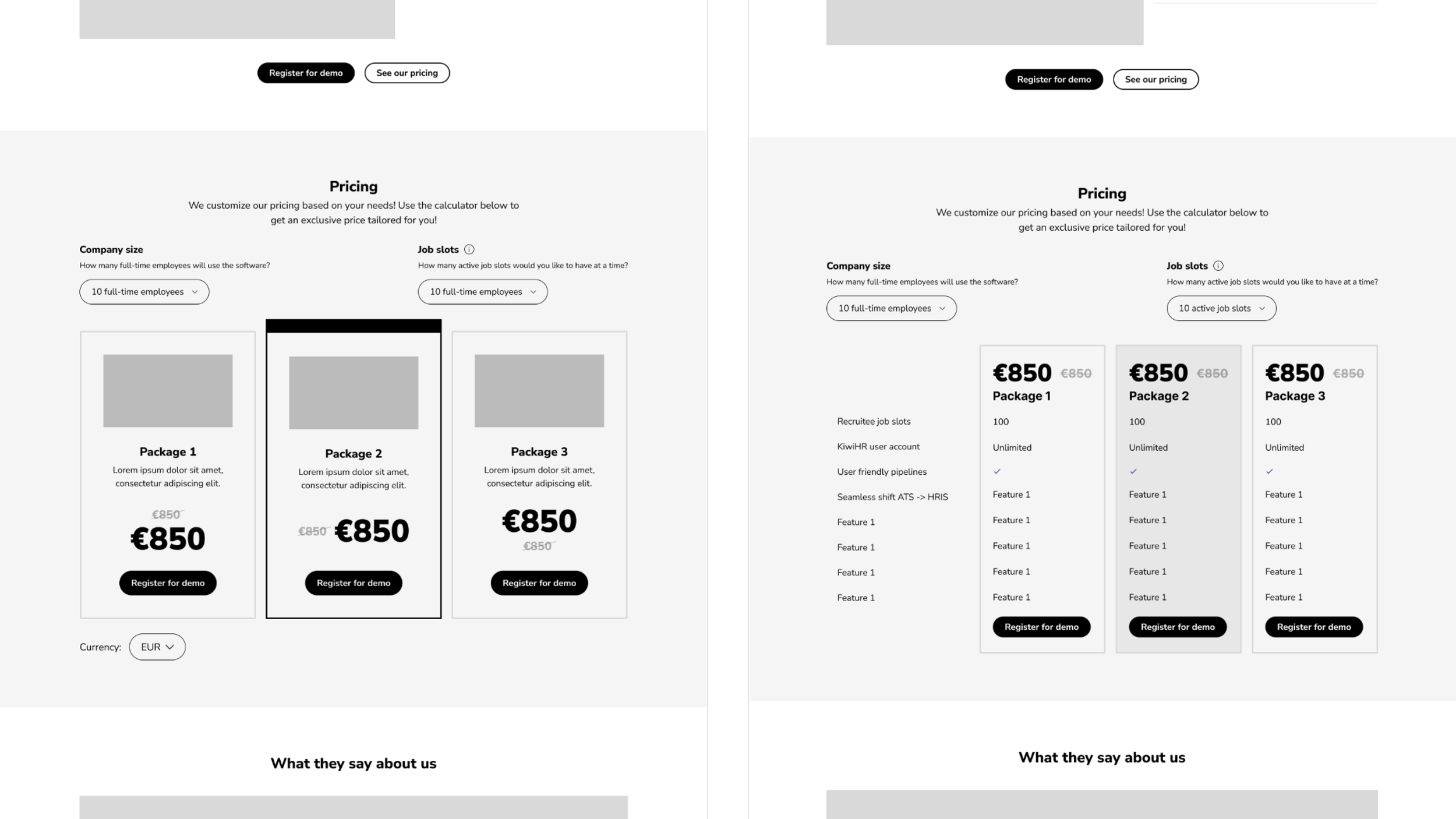
wireframes
The project brief didn't include content details for the pricing table, including the pricing model and features list. I crafted multiple options with varying content to address this gap.
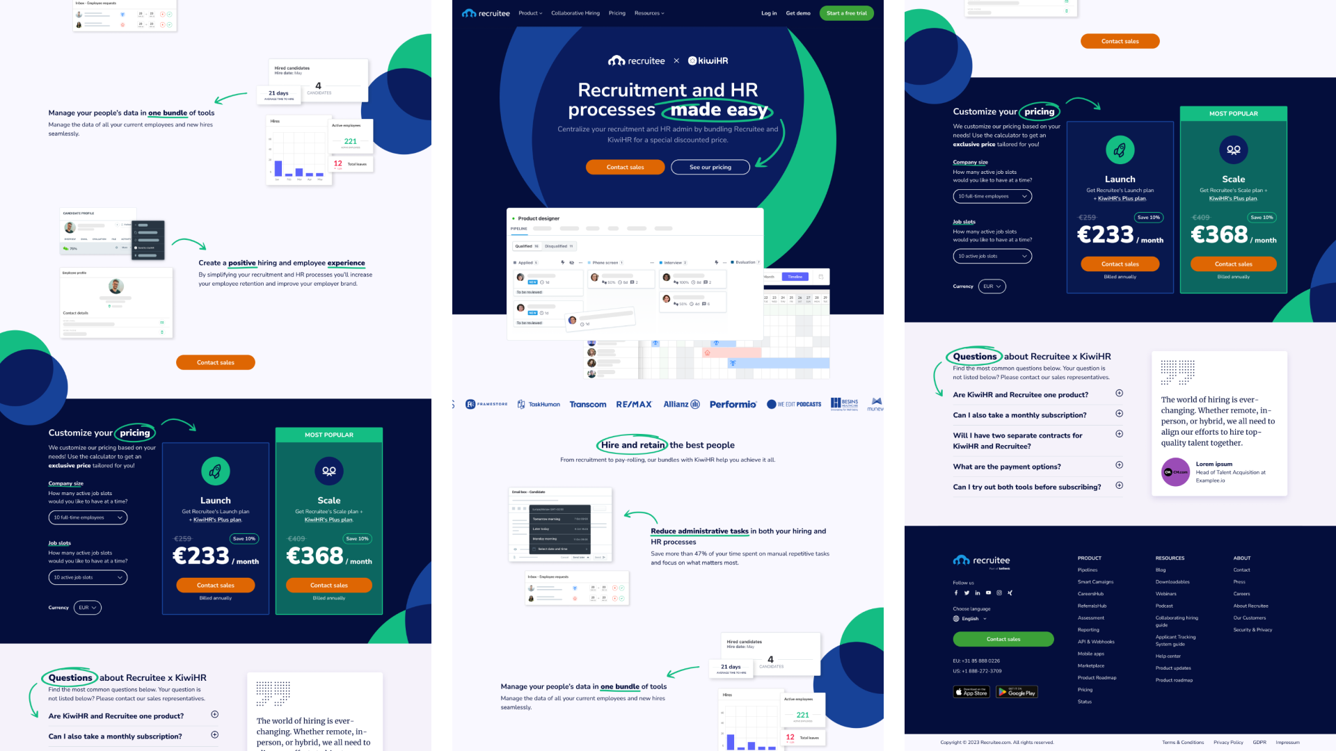
View more wireframe snippets — view in the Drive.
heatmaps
Due to time and budget constraints, the designs were tested using an AI heatmap generator, providing insights for design improvements. Some insights formulated from the heatmaps:
Wireframe
Pricing focus is on the wrong packages
Readability and scanability are good
The body needs to be more interesting to shift the focus from the footer
Final design
Handwritten circles are working to attract eye movement
The drop-down picker is overlooked
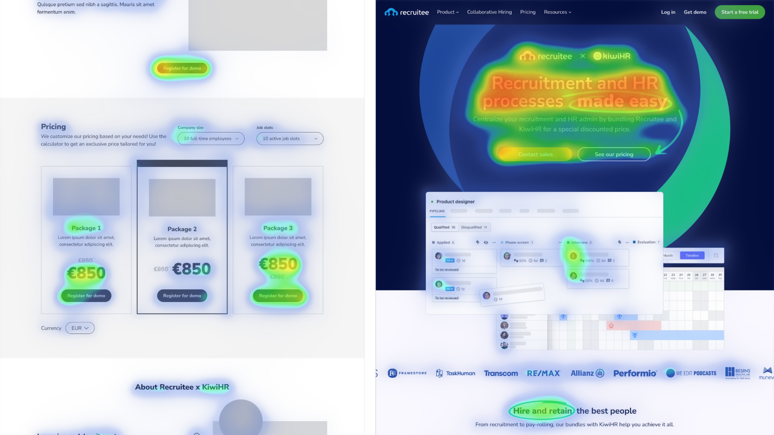
AI Heatmaps for final design & v2 wireframes — see the full version in the Drive.
How did decisions affect the UX?
Compromise — combined the KiwiHR elements and Recruitee branding guidelines really well, despite both being completely different.
Familiarity — blue-dominant colour scheme and illustrated visuals convey a professional yet familiar style of both brands.
Personality — handwritten elements tone down the formal feeling, ensuring a less rigid user experience.
success metrics
The landing page was successfully designed and developed
Visual cues (arrows and highlight circles) were reduced due to a development challenge and time constraints
reflection
There are various ways to start a design process, and empathising does not necessarily require a formal research structure or a cycle through a prototype followed by testing.
Addressing and solving problems becomes challenging with research constraints, time limitations, and premature decision-making.