
TGTHR is Recruitee's major annual event, increasing the visibility of Recruitee as an ATS software and educating HR practitioners on various HR topics.
✹TGTHR ✴︎
As an event host, Recruitee needs a landing page to become the one source of truth about the event and a method to collect attendees’ data.
design challenge
design decision
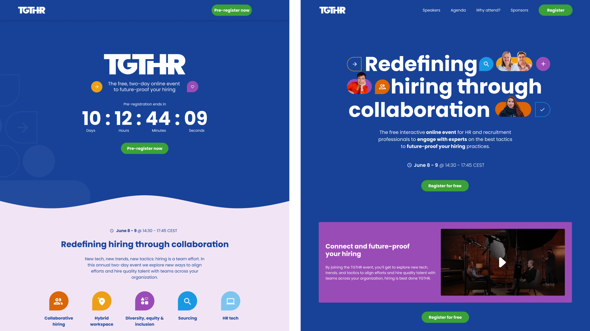
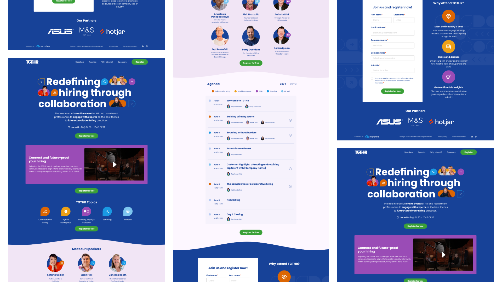
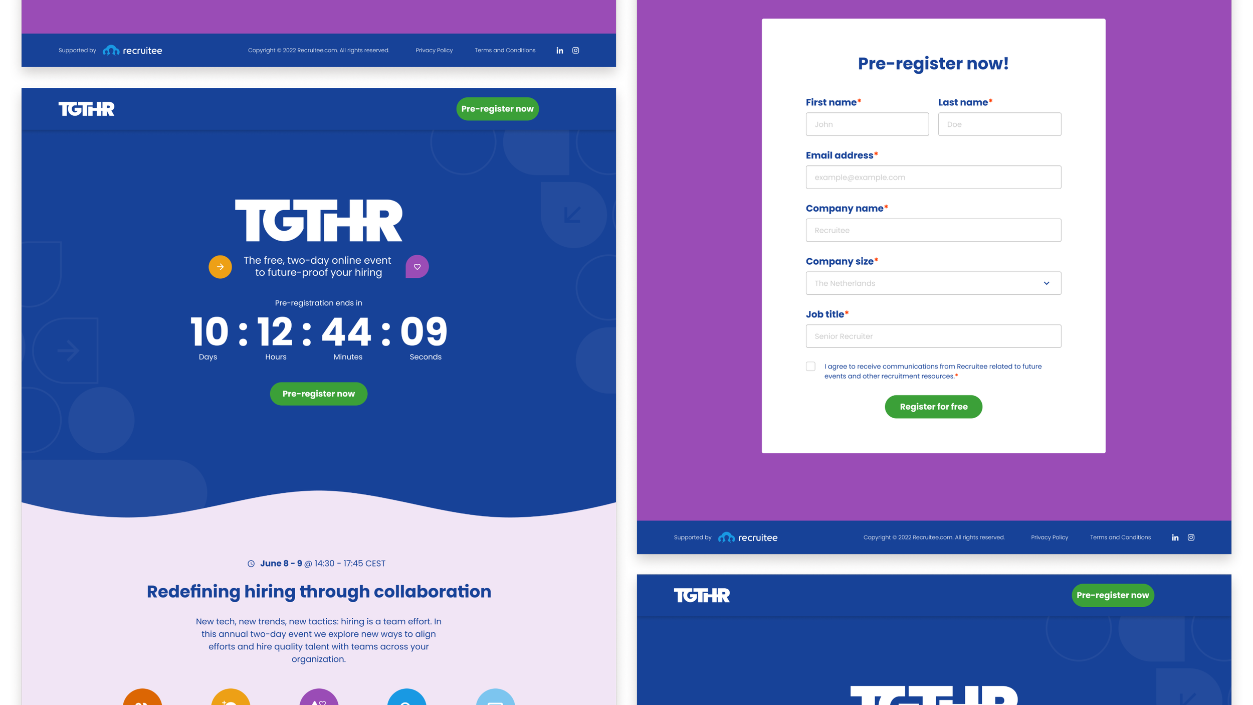
Key visual. The hero visuals emphasise the top speakers to attract and promote the event, ligatures to represent the keyword ‘together’ by making the characters look like they’re ‘holding hands’
Video. Video media increases excitement and builds momentum, smaller size since there’s not a lot of copy and added a highlight box to attract attention
Wave separator
Waves symbolise the flow and stream of learning.
Blunt arcs evoke less anxiety and impatience, offering a warm feeling.
A slightly flicked edge suggests the fun awaiting those who are patient in their learning journey.
Agenda. Improved focus, easier scanning, and reduced scrolling by implementing colour-coding, accordions, and content tabulations
Timer on the pre-registration. Positively creates a sense of urgency (UX principle: scarcity)
Live landing page — view the interactive prototype in Figma.
Pre-registration page — view the interactive prototype in Figma.
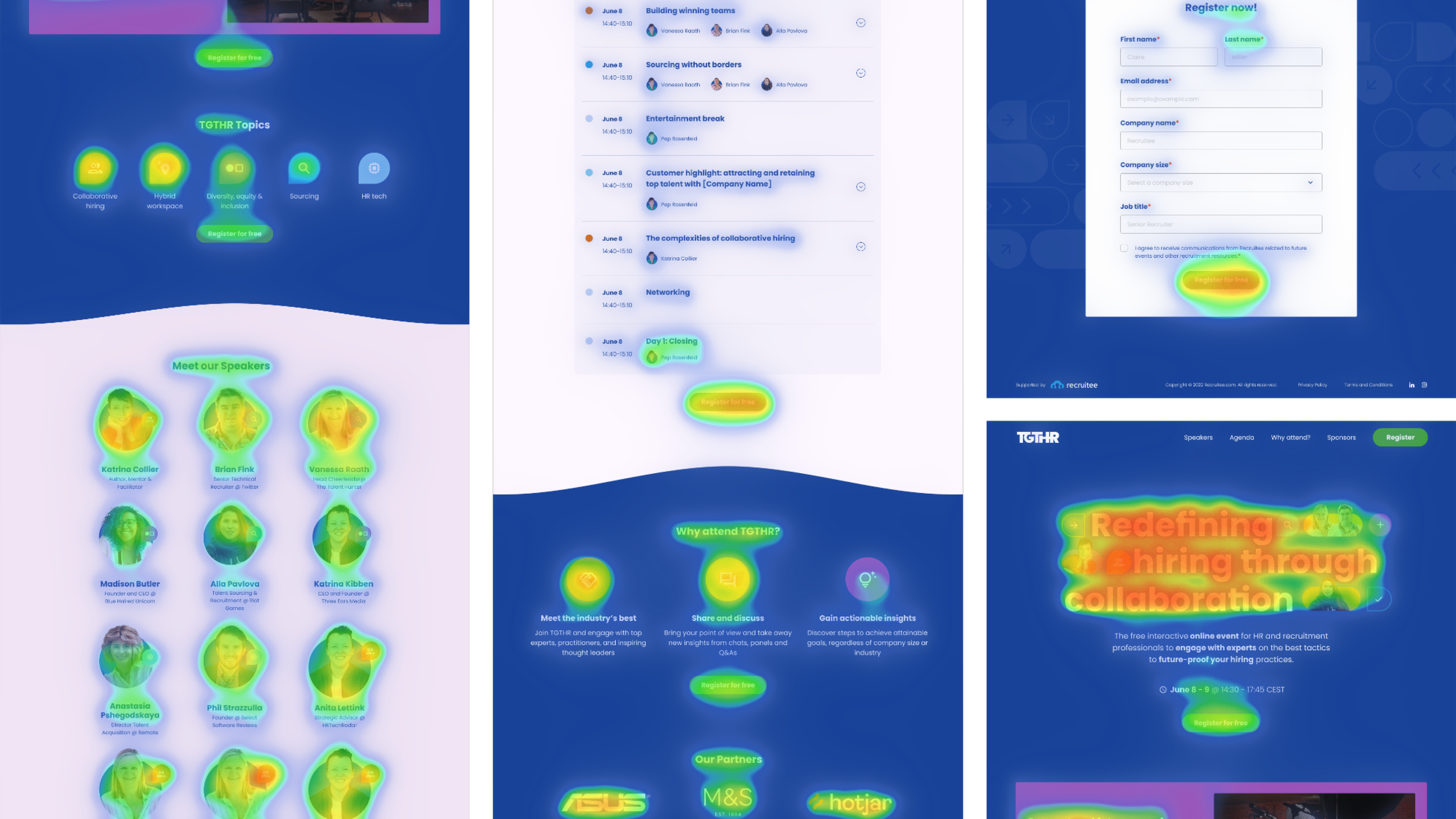
Heatmaps
Heatmaps were used for prototype testing and success measurement. The main goal is to test the information architecture of the page and the message Recruitee wants to send to the website visitor. Other goals prioritised throughout the testing:
Clarity of the visitor’s task. Do they know how to (pre-)sign up?
Section priority. Which sections of the page attract the most attention?
Tools used: VWO
Live site — see the full screenshot here
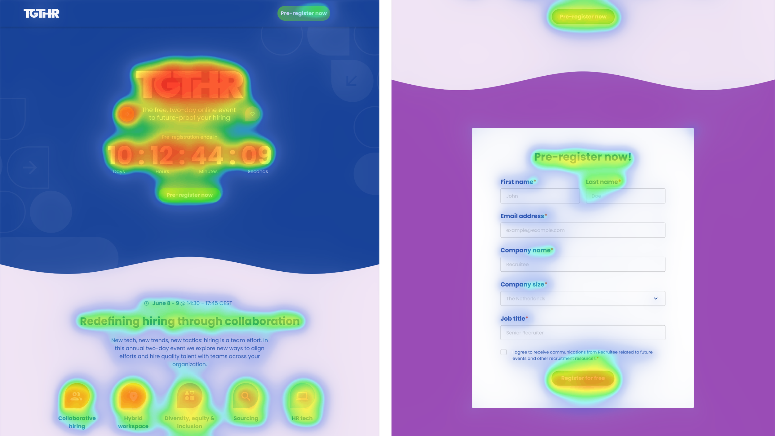
Pre-registration — see the full screenshot here
Success? Yes!
Fully functional landing page that tracks event registration, fulfilling both business and user needs.
Minimal design and development gap. The design was 90% developed without major difficulties/changes.
Reflection
Effective Visuals:
Adding faces and ligatures to the key visual increases the fun and togetherness.
Visuals, especially videos, are impactful in kickstarting the event's momentum.
Rounded, flowing, and colourful shapes convey the participants' feelings of learning, sharing, and enjoyment.
Accessibility Prioritization:
Techniques like color coding, accordions, and tabulations work well to organize information, preventing overload on one screen.
The techniques also minimize information in one screen allowing better control over information absorption with minimal clicks.