
FWDPay: pay it forward
FWDPay is a startup financial service aiming to simplify transactions through SMART Direct Debits. This project focused on improving user trust and usability, particularly for freelancers and small businesses who struggle with delayed payments and limited access to direct debit systems.
Outcome: the project delivered a redesigned mobile experience that addresses reliability, transparency, and ease of use as the key drivers of trust in financial platforms.
UI/UX designer ✴︎ UX researcher
project overview
problem statement
FWDPay faced difficulty gaining user trust and growing its user base due to its early-stage brand presence and unclear value proposition.
constraints
Timeline: 10 weeks (2 weeks research, 1 week insights)
Limited client input → a one-page brief was provided
Small research sample size → 2 participant interviews
research
Preliminary research (brief analysis)
Secondary (desk) research on trust, professionalism, and credibility
Qualitative interviews (freelancers and a small business owner)
Key insights:
Freelancers often experience delayed payments
Small businesses forget to pay due to manual processes
Trust depends on reliability, transparency, and ease of use
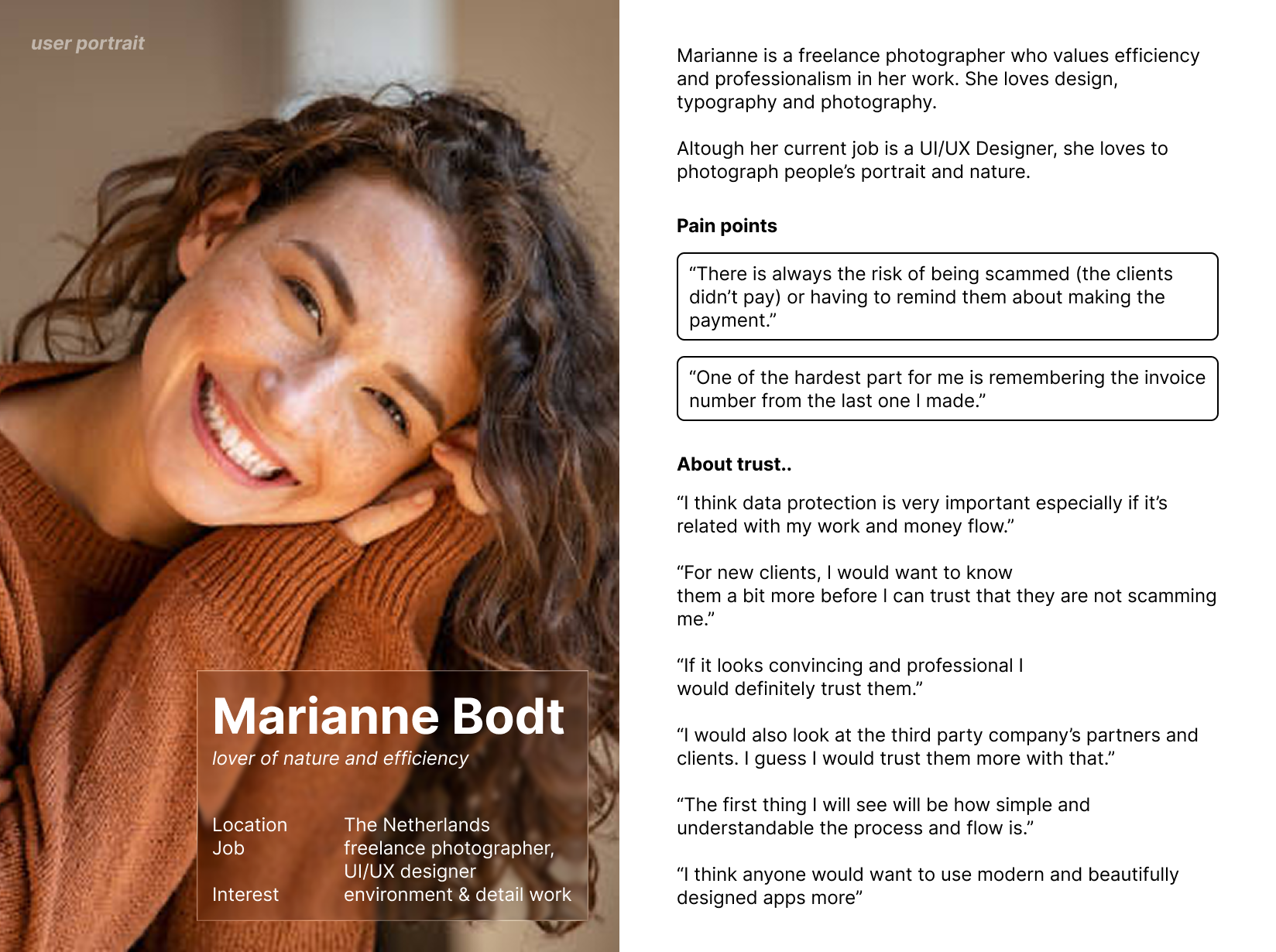
A user persona was created to guide decisions as a tool for empathising with the users.
design direction
Based on insights, the design focused on:
Reducing human error in payments
Increasing transparency in transactions
Creating a professional and credible visual identity
concept & prototype
Using ideation techniques, such as: brain dumps, “How Might We” questions, diverging and converging thinking. Some concepts were formulated focusing on:
Automated payment flows
Clear transaction tracking
Simple and intuitive interfaces
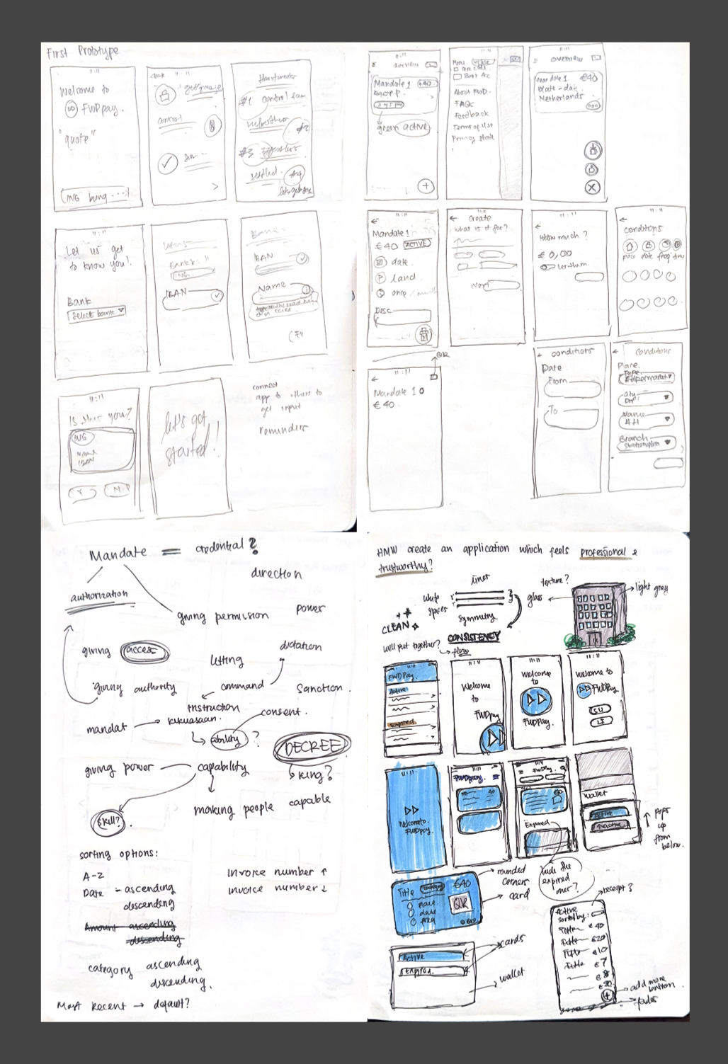
Initial low-fidelity prototypes were created to emphasise on improving user flow and clarity. Feedback received from client, peers, and users identified areas for improvement in usability and visual design for testing.
test & iterate
Informal usability test was done with think-aloud protocol and simple questioning about “What could be improved and how”.
Iterations focused on improving usability and visual clarity by simplifying navigation, refining layout and typography, and enhancing the overall look to feel more professional and trustworthy. These changes helped create a smoother and more user-centered experience.
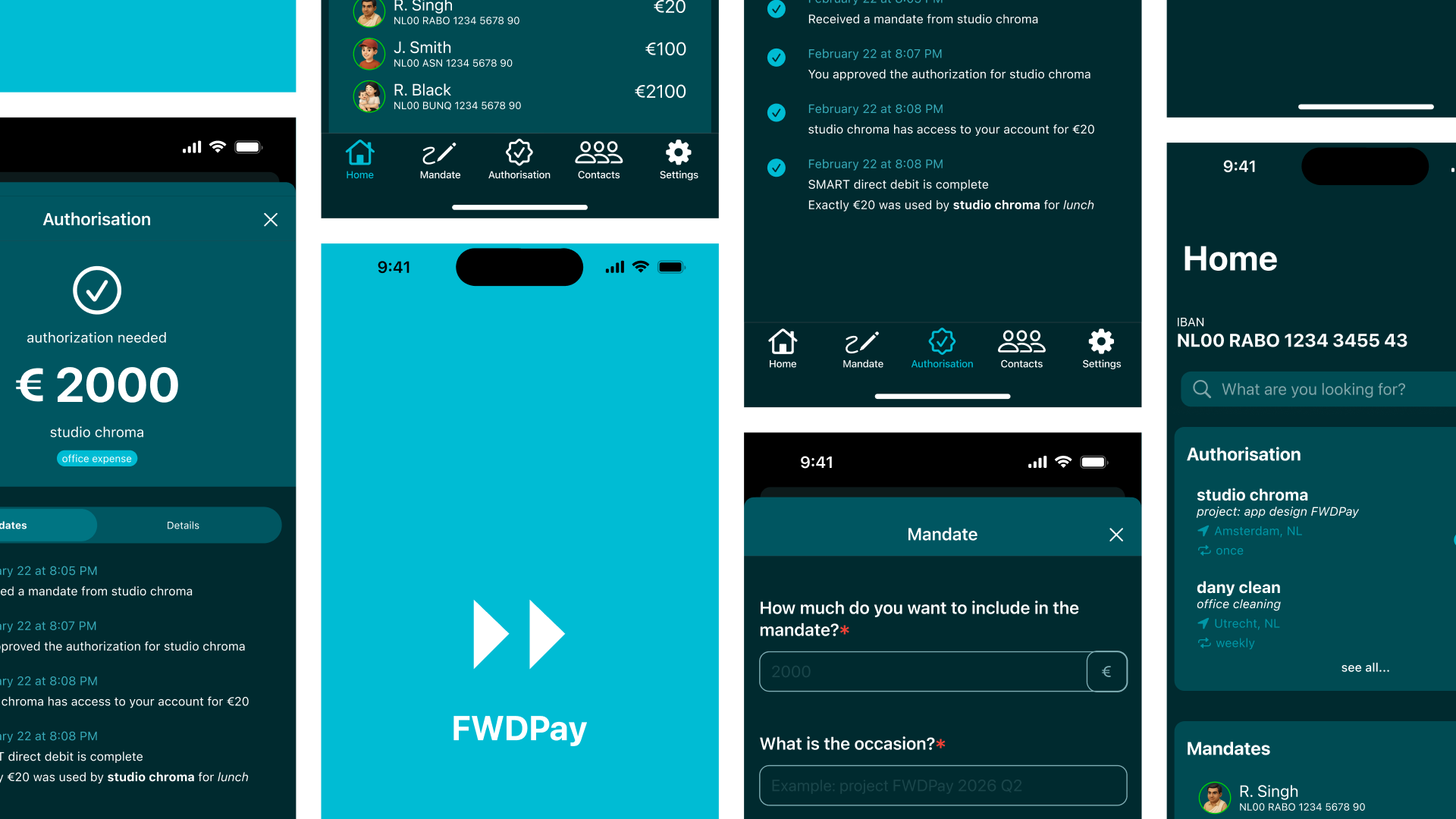
outcome/final design
The final design delivers a trustworthy and intuitive payment experience by directly addressing key user concerns around security, transparency, and ease of use.
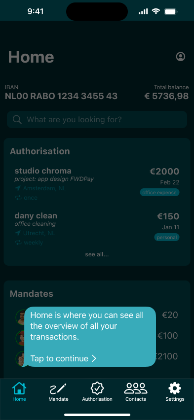
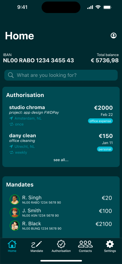
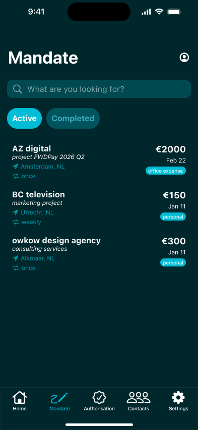
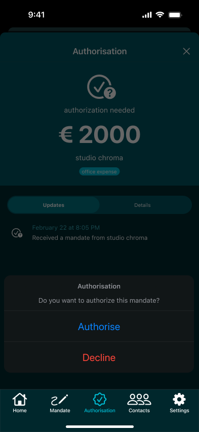
To reduce human error, the platform introduces invoice-based mandates, allowing freelancers to automate payments without needing to track invoice numbers or manually follow up. The mandate & authorisation feature ensures payments are executed based on agreed terms, minimising missed or delayed transactions.
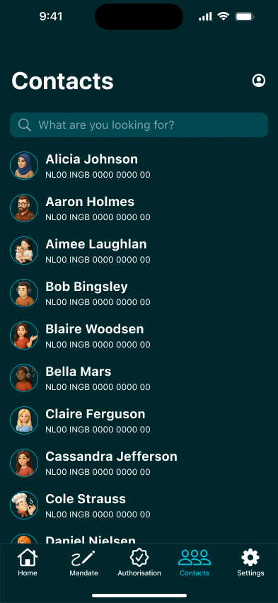
To increase transparency, every payment is linked to a clear invoice reference, giving users full visibility and control over their cash flow. The contacts (whitelisted vendors) feature also helps users quickly recognise and trust who they are transacting with.
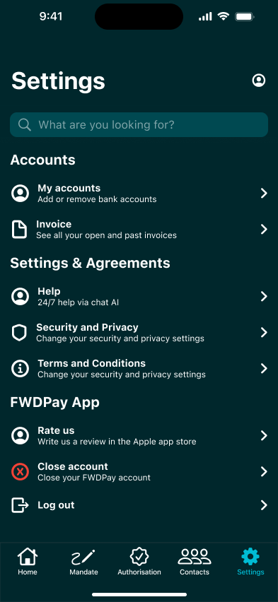
To build trust and credibility, the product uses a clean, modern interface combined with structured flows that make actions simple and understandable. Clear authorisation steps and secure data access reinforce confidence, while the professional visual design aligns with user expectations of a reliable financial service.
conclusion, learnings & next steps
conclusion
Was the project successful?
Yes—based on short-term goals.
Achievements:
Identified user needs, concerns, and motivations
Designed a more user-friendly and trustworthy platform
Delivered a validated prototype aligned with research insights
Limitations:
Long-term success (user trust and adoption) could not be measured due to time constraints
learnings
Research is critical:
Limited data led to challenges in defining direction. Stronger research would improve outcomes significantly.Start, even if imperfect:
Overcoming creative blocks requires action—ideas can always be refined later.Structure helps productivity:
Clear outlines and manageable tasks reduce overwhelm and improve focus.Divergence matters:
Exploring multiple ideas leads to stronger solutions, even if the first idea seems promising.
next steps
Conduct more in-depth user research with a larger sample
Refine personas with clearer needs and behaviors
Improve visual design consistency and branding
Usability testing with real users over time
Measure trust and engagement through real product metrics:
User adoption rate
Payment completion rates
Reduction in late payments
User trust/satisfaction scores
Retention rate